


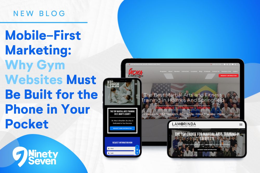
If your gym’s website isn’t built for the phone in your pocket, you’re missing your biggest opportunity to convert visitors into members. In today’s digital world, gym prospects aren’t just browsing your site on a desktop — they’re on their smartphones, often searching between errands, in line at the grocery store, or scrolling while waiting for a friend. In fact, more than half of all internet traffic now comes from mobile devices — and for local service businesses like gyms and fitness studios, that number trends even higher.
That’s why mobile-first marketing isn’t just a buzzword — it’s a business strategy. A mobile-first website is designed first for the way the majority of your potential members engage with your brand: on their phones. Let’s break down what mobile-first marketing really looks like, and why it’s essential for gym owners who want to grow.
Mobile-first design means you start with the smallest screen in mind. Instead of shrinking your desktop site to fit a phone, you build the experience for mobile first, then scale up for tablets and desktops. This approach puts mobile user experience (UX) front and center — and it’s rewarded by both users and search engines like Google.
A truly mobile-first site is:
Fast loading
Easy to navigate with a thumb
Clean and scannable
Designed around your most important conversion actions
Why? Because mobile users want what they want now, and they want it quickly. If your website makes them pinch-zoom, hunt for buttons, or wait for content to load — they’re gone. And for gyms, that often means they’re off to a competitor instead.
Mobile UX (user experience) is all about how people interact with your site on a phone. It’s more than just “it fits on a screen.” Mobile UX is about clarity, speed, and simplicity:
Readable text without zooming.
Buttons sized for thumbs.
Navigation that feels intuitive.
Information that’s prioritized by what mobile users care about most, like class schedules, trial offers, or membership pricing.
Think of mobile UX as the digital version of good gym signage — it guides your visitor to what they need without confusion. Today’s smartphone users are goal-oriented and impatient by nature. If they can’t accomplish what they set out to do — find your hours, get a free trial, or join a class — they’ll bounce. A mobile-first design ensures nothing stands in their way.
One of the biggest advantages mobile traffic offers? Phones can call. With a click. That’s a powerful conversion opportunity most desktop experiences can’t match.
A well-placed Click-to-Call button on your mobile site turns a curious visitor into a live conversation in one tap. For fitness businesses, this could mean:
A walk-in asking about a free trial
A phone call to schedule a consultation
A conversation that converts into a membership
Don’t bury your phone number in a footer or contact page. Treat click-to-call as a core mobile CT A — visible on your homepage, schedule page, and service pages. The easier it is for someone to reach you, the more likely they are to convert.
Pro tip: Make sure your phone CTA is large, colored, and always accessible without zooming in. Mobile users are often multitasking — they shouldn’t have to think about how to contact you.
Mobile screens are small — but that doesn’t mean opportunities to convert should be hidden. Sticky CTAs — buttons that stay visible as a user scrolls — can boost conversions by keeping your most important actions front and center.
For a gym website, sticky CTAs can include:
Book a Free Class
Start Your Trial
Get Membership Info
Call Now
When prospects don’t have to scroll up or down to convert, they’re more likely to take action. This is especially true on mobile, where attention is fleeting and competition for interest is fierce. Sticky CTAs reduce friction and improve your mobile conversion rate — plain and simple.
Design these CTAs with contrast, clear labeling, and placement that doesn’t block content. Good sticky CTAs feel helpful, not intrusive.
If your goal is lead capture — like signing someone up for a trial or newsletter — then your mobile forms have to be optimized for the device people are using.
Here’s how to get mobile forms right:
Ask only for essentials: Name, email, phone — no long surveys.
Use autofill and input masks (e.g., number keyboards for phone fields).
Make buttons large and tappable.
Add minimal steps — the more screens to fill out, the higher drop-off happens.
Mobile forms are conversion engines — but they can also be conversion killers if they’re too long or awkward to complete on a phone screen. Keep them short and smart. You’ll increase leads and improve overall site performance.
Today’s gym members expect speed, clarity, and immediacy. A mobile-first site doesn’t just look better on phones — it works better for your business. More people find you, interact with you, and choose you when your mobile experience is seamless and focused. That means better SEO, higher engagement, and ultimately more conversions.
Mobile traffic is where your prospects live. If your gym website treats mobile as an afterthought, you’re leaving both leads and revenue on the table.
If you want a website that meets your audience where they are — in the palm of their hand — and turns curiosity into membership, your mobile strategy has to be intentional, optimized, and conversion-driven.